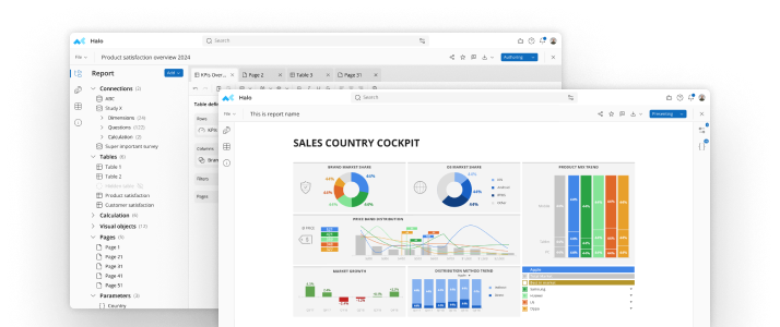
Survey analysis software can eliminate a lot of work when you’re poring over your data, but you still want to provide direction to ensure you extract the information you want and need. Below you’ll find four different ways you can analyze the data you’ve collected, with the ideal method based on the type of information you’re looking for.Graphical Analysis Graphical analysis involves using any type of visual format to showcase your data. Displaying your data graphically can make it much simpler to identify patterns and pinpoint differences within your results. Some of the more common graphical options include:
- Bar charts: Solid bars that can appear horizontally or vertically that extend to match with values indicated on the X axis or Y axis of the chart
- Pie charts: Circle graphs where the full circle represents 100 percent; sections of the pie are typically displayed in different colors to indicate different the percentages that make up the whole
- Line charts, scatter graphs, area charts: Graphs that use a series of data points, usually best for representing changes in data over an extended period of time
See also: 7 Things You Need to Know About Survey Analysis SoftwareFrequency Tables Frequency tables outline the different response options as well as the number and percentage of people that chose each response. Although they can in some cases feature the same information as a pie chart, they tend to work better than pie charts when the differences between the percentages are rather small. Best Color for New Product CountPercent Red54152%Orange19219%Green26026%Cross TabsCross tabs, or cross tabulations, use a table to compare data from different subgroups. Like frequency tables, cross tabs use rows and columns to display the data. Cross tabs are particularly useful for comparing responses across a variety of demographic groups. Best Color for New Product Female MaleRed36%67%Orange14%23%Green50%10%TOTAL COUNTS395598See also:Tips for Creating Reports from Survey Analysis Software DataFilteringFiltering is one of the least frequently used tools when it comes to analysis, but taking advantage of it gives you an incredible range of analysis options. Filtering allows you to select different subsets of data for review, and then examine all responses from a specific subset. A few ways to use filtering include:
- Filtering for all respondents that provided a negative response to a specific question, and then looking at the answers to their other questions to see why they may have responded negatively
- Filtering for a target population to review habits, responses or buying intentions, such as filtering for males over age 40 that make $50K or more each year
- Filtering for specific dates if you consistently run customer satisfaction or other surveys, allowing you to see how satisfaction rates or attitudes have changed over time
Because filtering eliminates unwanted responses from your current view of the data, you’ll be able to perform your analysis much more rapidly. You can look at the same question with a variety of different filters applied, giving you a number of insights you may have otherwise missed. Just make sure you clear the filters before attempting to analyze your data as a whole so you’re again including all responses. Feel free to experiment with the different analysis types to find the one that best suits your needs. Just remember to use care and precision with all of them to ensure accurate results. And whatever method you chose, also remember that data analysis software is at the ready to make your job even easier.
See mTab Halo in Action
Make smarter decisions faster with the world's #1 Insight Management System.


