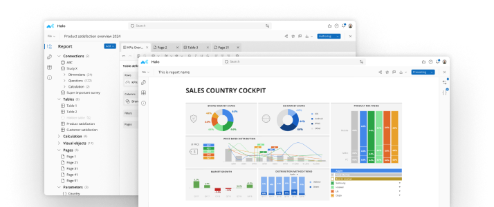
Today's data analysis tools are more sophisticated and robust than ever before. But complexity is not necessarily better. If a tool is too complex it looses efficiency until it is no longer cost effective to use. Think Space Shuttle. What is needed are user friendly data analysis tools.User friendly data analysis tools are tools that you, the end user, can employ to accomplish analysis tasks quickly, easily and efficiently. They work intuitively. They do not require extensive training.For many analysts, data visualization is the best method for understanding and communicating complex data relationships. The human mind identifies and recognizes patterns more intuitively when presented visually through charts and graphs as opposed to presenting data points and lists.But simply presenting data visually is only half the challenge. Creating those charts and determining which are relevant is a time consuming and manually laborious task that's prone to input error.Answering that challenge is what mTab™ and it's companion product mTabView™ have been doing for years.Ready-to-use datamTab's™ sophisticated database compression technology quickly and easily turns raw data into ready-to-use data. This powerful feature means engaging in hands-on analytics without extensive training and without relying on your vendor to do the heavy lifting, setting up and manipulating the data.In today's cost sensitive business environment, many company's seek user friendly data analysis tools that allow analysts to spend more time analyzing and less time parsing raw data, creating charts and preparing reports. mTab™ is designed with the spreadsheet user in mind. Its user interface will be familiar to anyone who has ever used a spreadsheet thereby creating a synergy between the data, the interface and the analyst, resulting in higher productivity and deeper analysis.Create, update, presentOnce the initial analysis is done and it's time to create a meaningful report, the task of manually generating multiple charts can be daunting to even the most experienced analyst. That's where mTabView™ comes into play. It automates the creation and update process by linking the survey data directly with the charts. Update the data and the charts are automatically updated. There is nothing more user friendly than automation and the ultimate in ease-of-use is mTabView's™ one click export to PowerPoint. With just one click your tables, charts and graphs are loaded into fully customizable PowerPoint slides.And that is only the surface!
See mTab Halo in Action
Make smarter decisions faster with the world's #1 Insight Management System.


