In the highly regulated utility industry, customer satisfaction is paramount, and it is critical that utilities place customers at the center of planning initiatives and business strategies. Utilities realize this and are investing in proprietary and syndicated customer satisfaction research data. Many companies are exploring dashboards as a way to drive insights and distribute this customer satisfaction data throughout their organizations. Here we present five best practices we have learned through years of building custom dashboards for multiple utilities companies.
- Quickly align on which data sources will be used. Customer satisfaction dashboards can present a wide range of data including internal operations data, proprietary research data, and syndicated customer satisfaction data (e.g., JD Power, MSI, E Source, etc.). Early agreement on which of these sources of data will be included in the dashboard is key, because the number and disparity of data sources greatly influences the complexity of data gathering and structuring.
- Determine which Key Performance Indicators (KPIs) are most important and how they will be presented and tracked. After the data sources are selected, there are several questions which must be answered to determine which parts of the data are presented:a. Is overall customer satisfaction the most important metric to monitor, or are the underlying drivers of customer satisfaction (reliability, price, billing and payments, etc.) also essential?b. Will comparisons to competitive utilities be shown? If so, is quartile or absolute ranking (or both) the metric to be tracked?c. Will data be presented as a snapshot in time or as a year-over-year trend?d. Will data be presented based on a calendar year or according to the study year of a syndicated database?The answers to these questions will largely determine the type of the data included in the dashboard.
- Determine who the internal customers of the dashboard are and how they will best interact with the data. Dashboards can be widely distributed throughout utilities or used only in customer insights / market research groups. Decide who the key internal customers of the dashboard are and how they will best digest the customer satisfaction data: do they prefer tables vs. graphs? Pie vs. bar charts? Etc. Determining this will help ensure that the dashboard is widely used and provides insights that enable actions to improve customer satisfaction.
- Anticipate how the dashboard will be used throughout the organization. Will internal customers be exploring the data and performing analysis within the dashboard or primarily exporting screenshots of the dashboard to be disseminated? If the former, an interactive dashboard with click-through ability, hover over features, and useful filters is recommended, while a report-like dashboard with few interactive features is recommended for the latter. Projecting how the dashboard will be used upfront will inform the required product features and development time.
- Align on visual themes. This may seem trivial, but color palettes, logos, and page themes are one of the first things that users of the dashboard will notice and are often debated at length during development. Aligning on the visual themes of the dashboard before development begins will ensure that corporate identity is maintained in the dashboard, and it will reduce the number of iterations that occur during development, reducing the time to product completion.
While there are many things to consider when creating a customer satisfaction dashboard, these five best practices will act as great building blocks for an effective dashboard, which will allow utilities to seamlessly track, analyze, and present customer satisfaction data.


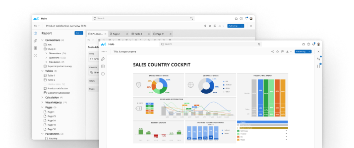
See mTab Halo in Action
Make smarter decisions faster with the world's #1 Insight Management System.
Insights for everyone, all in one place.
Book a demo