
You have 1,000 survey responses and a headline number: 37.8% of respondents say they would buy the product. That is a useful start, but the next question arrives immediately. Who are they? Does the answer change by age, by region, by whether they already use a competitor?
Answering those questions is what a crosstab is for. You will also see it written as “cross tab”, “crosstabs” or “cross tabulation”, and statisticians call it a contingency table. This guide shows how a crosstab is built and read, defines the vocabulary, and links to deeper articles on each part.
Key takeaways
- A crosstab (cross tabulation) shows how answers to one question split across the groups of another, such as purchase intent by age.
- Read column percentages down each group, and always check the base size under each column.
- Significance letters tell you which differences between columns are larger than sampling noise.
- Banner tables run many crosstabs at once: the same questions across every group you report on.
What does a crosstab look like?
Here is a small crosstab with illustrative numbers (not real survey data). The question is purchase intent, grouped into three nets from a five-point scale, and the respondents are cut by age band.
| Purchase intent | Total | 18–34 (A) | 35–54 (B) | 55+ (C) |
|---|---|---|---|---|
| Base: all respondents | 1,000 | 400 | 350 | 250 |
| Net: would buy (top 2) | 378 (37.8%) | 192 (48.0%) BC | 126 (36.0%) C | 60 (24.0%) |
| Might or might not buy (middle) | 300 (30.0%) | 120 (30.0%) | 105 (30.0%) | 75 (30.0%) |
| Net: would not buy (bottom 2) | 322 (32.2%) | 88 (22.0%) | 119 (34.0%) A | 115 (46.0%) AB |
Each cell holds a count and, in brackets, a column percentage. The column percentage is the count divided by the base at the top of that column. For the 18–34 column, 192 divided by 400 is 48.0%. Every column adds up to 100%: 48.0 + 30.0 + 22.0 for the first one.
The bold letters are significance markers. A letter beside a cell means that cell is significantly higher than the column carrying that letter. The “BC” next to 48.0% says that 18–34 respondents are more likely to buy than both the 35–54 and 55+ groups. The middle row has no letters because all three groups sit at 30.0%.
In this illustration the differences were tested with a two-proportion test at 95% confidence. Software may use a different test, so check what your tool reports.
The story is now visible. Intent falls steadily with age, and the oldest group is the most likely to say no. The total column alone, at 37.8%, hid all of that.
What does a crosstab of real survey data look like?
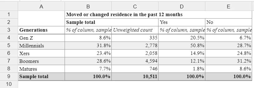
The next table, from a sample of about 10,500 respondents, shows generations by whether people moved or changed residence in the past 12 months. Each cell shows a column percentage and the unweighted count.
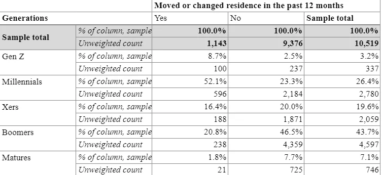
Read down the “Yes” column. Of the 1,143 people who moved, 100 are Gen Z, which is 8.7% (100 divided by 1,143). Among the 9,376 who did not move, Gen Z is only 2.5%. Millennials are 52.1% of movers and 23.3% of non-movers, while Boomers are 20.8% of movers and 46.5% of non-movers.
The pattern is clear: people who moved skew younger. In statistical terms the two variables are associated. If there were no relationship, the percentages in the “Yes” and “No” columns would look about the same.
What is the terminology behind a crosstab?
Crosstabs come with a short vocabulary. Once you know these terms, a report from almost any tool becomes readable.
| Term | What it means | In the purchase-intent example |
|---|---|---|
| Stub | The row labels down the left side, usually the answers to one question | The three purchase-intent rows |
| Banner | The column headings across the top, usually demographics or segments | Total, 18–34, 35–54, 55+ |
| Cell | One intersection of a row and a column | 192 (48.0%) |
| Base | The number of respondents a percentage is calculated on | 400 for the 18–34 column |
| Net | Two or more answer categories combined into one row | Would buy = definitely plus probably |
| Column percentage | A cell count divided by the column base | 48.0% = 192 / 400 |
| Row percentage | A cell count divided by the row total | 50.8% = 192 / 378 |
| Significance letter | A marker showing a cell is statistically higher than another column | BC beside 48.0% |
What is a banner, and why define it once?
A banner is the standard set of column groups applied across a whole report: total, then demographics, then segments, brands used, regions. Defining it once means every question is cut the same way, so readers learn where to look and results are comparable from page to page.
Banners can be nested, for example income within gender. That answers more specific questions, but each column’s base gets smaller, and small bases give unstable percentages.
What is a base?
The base is the group a percentage is calculated on. It is the most overlooked part of a crosstab. A 60% on a base of 20 people and a 60% on a base of 2,000 look identical and mean very different things.
Weighted data adds a second wrinkle. Many reports show both the unweighted count (actual respondents) and the weighted base (what the weights make the sample represent). Show both, and say which one the percentages use.
What is a net?
A net combines categories so a result is easier to read and less noisy. The “top 2 box” on a five-point intent scale, “definitely” plus “probably” would buy, is a net. So is an age net such as 18–34 built from several narrower bands. Always make clear which answers sit inside a net.
Should percentages be column or row percentages?
Column percentages answer the question “of the people in this group, what share said this?” That is the convention in survey reporting, because the columns are the groups you want to compare.
Row percentages answer “of the people who said this, what share belong to each group?” In the example, the 378 people who would buy split into 192 aged 18–34, 126 aged 35–54 and 60 aged 55+. Divided by 378, that is 50.8%, 33.3% and 15.9%, which add up to 100.0%.
Both are correct, but they answer different questions, and mixing them up is the most common way to misread a table. Notice that 18–34 respondents are 40% of the sample, so they would make up about 40% of buyers even if age made no difference. A row percentage mixes the attitude with the sample’s makeup. State which one a table uses.
The same applies to the generations example above. Using its counts, 100 of the 337 Gen Z respondents moved, which is 29.7%, compared with 21 of 746 Matures, which is 2.8%. That is the row view, and it tells you how likely each generation was to move. The column view told you who the movers are.
How do you do a cross tabulation, step by step?
The mechanics are simple, and the care goes into the choices. Here is the procedure.
- Choose the row variable. This is the question you want to understand, such as purchase intent.
- Choose the column variable. This is the way you want to cut it, such as age band. Pick variables that matter to a decision, not every demographic you collected.
- Count respondents in every combination. The count of 18–34 respondents who would buy is one cell.
- Divide by the column base. Do that for every cell in the column to get column percentages that sum to 100%.
- Show the base. Put the number of respondents at the top of each column.
- Test the differences. Flag cells that differ from another column by more than chance would explain at your chosen confidence level, usually 95%.
Variable and category choices shape the result. Splitting age into three bands versus seven can change which differences reach significance, so decide the groupings from the business question before you look at the output.
What does a crosstab with more than two variables look like?
A two-way table has one variable down the side and one across the top. Most survey reports go further. The table below puts beer consumption in the rows and three variables in the columns: age, and annual income within gender, which is a nested banner.
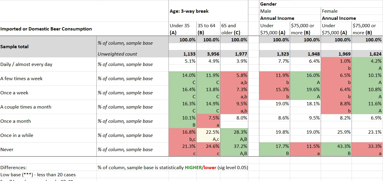
It also shows significance testing in a real report. Columns are labeled A, B and C within each group. In the age block, “C” under 14.0% for the under-35 group means that figure is significantly higher than the 65-and-older column. Green shading marks a figure significantly higher and red marks one significantly lower, at the 0.05 level shown in the table notes. The notes also flag low bases: results on fewer than 20 cases are marked.
If you want the full picture of how one-way and two-way tables relate and where nested banners fit, one-way vs. two-way tables and where crosstab software fits goes further. In short, a one-way table summarizes a single question, the percentage choosing each answer. A two-way table adds a second variable as columns. Because the business question is almost always “for whom” rather than “how many”, most findings live in two-way tables.
How do you read a crosstab correctly?
Read it in this order.
- Start with the base. Every column has its own base. Many teams treat percentages on a base under 50 as unstable and under 30 as directional only, but the threshold is a convention, so set yours before you see results.
- Confirm the percentage type. Column percentages compare groups. Row percentages describe composition.
- Check the significance markers. A gap between two columns is a signal only if it is flagged. With dozens of comparisons on a page, some will be flagged by chance alone, because a 0.05 level means roughly one in twenty tests on pure noise will pass.
- Watch multiple-response questions. When respondents can pick several answers, percentages add up to more than 100%. The base is respondents, not responses.
- Check the weights. Weighted percentages with both weighted and unweighted bases visible are easier to trust.
Then read for the pattern, not the individual cells. In the first example the pattern is a steady decline with age. A cell-by-cell reading misses that.
When should you use a crosstab instead of a pie chart?
A pie chart shows how one group divides into parts of a whole. It works when you have one group, a handful of categories and the point is the share, for example how total respondents split across three plans.
A crosstab is better when the question compares groups. A pie chart for each age band would force the reader to compare slice angles across three circles. The table puts 48.0%, 36.0% and 24.0% next to each other. A crosstab also carries things a pie cannot: the base, the significance markers, many answer categories without clutter, and a single page per question across the full study.
They work together. Use the crosstab to find the pattern, then chart only the cells that carry the finding, usually as a bar chart. The chart shows the story while the table keeps the evidence, and a reader can check the base behind any bar.
How is a crosstab different from a pivot table or a list?
A pivot table also summarizes two fields in a grid, so the two get confused. But a pivot table counts records in a spreadsheet, while survey analysis needs weighting, multiple-response handling, nested banners, consistent base definitions and significance testing, applied across hundreds of questions and several waves without rebuilding each table. The full comparison, including alternatives, is in the difference between crosstabs and pivot tables.
A plain list of results is a different tool again. It is fine when you want one ranked set of answers for a single group. If you are weighing the two, crosstab vs. list: pros, cons and best uses lays out when each wins.
What are the most common crosstab mistakes?
- Reading row percentages as column percentages. The two numbers can differ widely, and the wrong one leads to the wrong conclusion about who does what.
- Ignoring the base. A striking percentage on 15 respondents is not a finding. Look at the base before the number.
- Treating an unflagged difference as real. A gap of a few points between two columns may be noise. Rely on the significance markers rather than the eye.
- Cutting the data too many ways. Each extra layer of banner shrinks the bases and multiplies the comparisons, so more spurious flags appear. Define the cuts from the questions you are trying to answer.
- Concluding cause from association. A crosstab shows that groups differ. It does not explain why.
How do you create crosstabs in practice?
For a handful of questions you can build crosstabs by hand or with a pivot table. For a full study, crosstab software saves you from rebuilding the same table for every question and every wave. Halo Reports, mTab’s reporting product, produces crosstabs and banner tables with weighting and significance testing, along with charts and interactive report pages. When a follow-up question comes up that your banner does not cover, you can ask it in plain language and get an answer from your own research, with the source shown.
What should you do next?
Pick one decision you are working on and one question that bears on it. Write down the two or three groups you suspect will answer differently, set your minimum base size, and build a single crosstab for that question. Read the base first, then the significance letters, then look for the pattern across the row. If the table raises a better question, that is the next table to build. Insights teams that run wide, complex studies and global trackers can keep that work on one governed platform.