How to Create Infographics with Data

Visualizing survey data doesn’t have to be limited to internal presentations and reports. You can easily share pertinent data with your clients, customers or any other audience by transforming that data into a captivating infographic. Here’s how.
Gather Your Data
You may have data on hand you want to showcase, or you may need to collect a fresh batch. In either case, determine the point you want to make with the information. If you need to collect new data to support your point, craft survey questions that all relate back to it. As with all surveys, also ensure you distribute your survey to enough respondents, so your results are statistically significant for each sub-segment. In-depth analysis comes next, giving you the insights you need to explain why each data point is important.
Determine the Data’s Story
Your data’s story is something that resonates with your audience members, connecting to them on an emotional or intellectual level. Some stories may be obvious and easy to create, such those related to surveys about love or relationships. More technical data may make it tougher to find an intriguing story associated with the results. While you want to focus on pertinent points that strengthen your story, you don’t want to skew the information. If your story is about a massive increase in customer satisfaction over the last two quarters, for instance, you still want to show data from the first two quarters – even if satisfaction was lower than average.
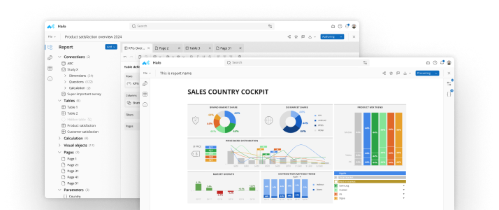
Select Appropriate Graphs and Charts
Select charts and graphs that allow you to visualize survey data without skewing the results. Simple pie charts may work best for straightforward yes and no results, although you may want to consider data maps for large amounts of information and line graphs for showcasing trends over a period of time. Other options can include bar graphs, pictograms and stacked line graphs.
Opt for a Data-Rich, High-Impact Design
High visual impact is one of top features of an infographic, so make sure you capitalize on that fact with an eye-catching design. Even if you use several different types of charts and graphs within your infographic, make sure the fonts, line widths and color schemes remain consistent.Breaking down your data’s story into a main question, or a series of questions, allows you to answer each question with a different graph or chart. Using an infographic that’s divided down the middle can illustrate before and after results, or comparisons over two different time periods.Another effective infographic strategy for visualizing survey data is to break your data into different sections. Each section can relate back to the main question or theme, providing more information to support various aspects of it.
When proofing your infographic, make sure the information is evident at a glance, easy to follow, and not cluttered with too much extra information, distracting colors or icons. Keeping your infographic simple is typically preferable to making it too loud and confusing, and these tips can help ensure it’s both simple and compelling at the same time.
Make smarter decisions faster with the world's #1 Insight Management System.