Introduction
Over the last year I have had countless conversations with people at conferences and with current and prospective clients on PowerPoint vs. dashboards for survey data. Many view this discussion as the old world vs. the new, but there are staunch members of both camps, and there isn’t a cut and dry answer to the question “Which is better?” Let’s explore some of the strengths and weaknesses of each.
PowerPoint
Microsoft PowerPoint has been around ~30 years, and during this time it has become the language of business; however, for many years, people have been arguing that PowerPoint is dying an inevitable death as a result of the emergence of various dashboard authoring tools. Back in 2013, one dashboard authoring company even made the bold prediction in a blog post that “A year from now, everyone will have forgotten about the PowerPoint dark ages.” This couldn’t have been further from the truth. How many of you have created, read, or sat in on a PowerPoint presentation in the last week? Two weeks? Month? I would bet 90% of you have.Figure 1: Percent of Projects that use PowerPoint, Online Dashboards, and Other Deliverables

Source: FocusVisionAs the graph above shows, not only is PowerPoint still the definitive market leader in information distribution, usage of PowerPoint drastically *increased* from 2014-2016. That certainly doesn’t look like the trend of a dying product.So, what are the strengths of PowerPoint that are keeping it at the top? PowerPoint presentations are cheap to produce, can be put together relatively quickly, and are therefore perfect for ad-hoc reports or for quick sharing of insights. Virtually anyone can open PowerPoint and get their ideas down. PowerPoint reports are also easy to edit—even if someone is not adept at creating presentations (think of the senior partners at your firm, or executives in your company), they would be able to open a presentation, move things around, and edit text. Finally, as mentioned above, PowerPoint is still the lingua franca of business, and as such, a PowerPoint presentation or report needs never be accompanied by instructions for use.Let’s also explore some of the weaknesses of PowerPoint. First and foremost, PowerPoint feels “old school” to many, and a PowerPoint presentation, no matter how many animations you build in, lacks a “wow” factor. Additionally, PowerPoint is often misused in presentations and not always an effective way to supplement verbal presentations (see this article by Forbes). Lastly, off-the-shelf PowerPoint reports do not dynamically connect to underlying data, so if the data being presented in PowerPoint is refreshed at a regular cadence, the report will have to be manually updated.
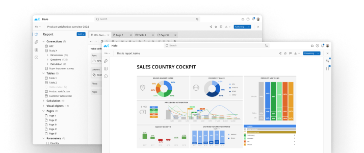
Interactive Dashboards
Many people view interactive dashboards as the Ferrari to PowerPoint’s station wagon, and there are reasons why many (somewhat erroneously) believe that dashboards are killing PowerPoint. First, dashboards offer users a much more engaging experience with the ability to apply global data filters, change chart types / presentation methods on the fly, and click-through pages to deep dive into data. A well-designed dashboard with lots of interactivity is a surefire way to wow clients or internal stakeholders. Additionally, dashboards can be created to directly connect to underlying data sources, allowing the dashboard to automatically update with each refresh of data. Finally, dashboards are accessible on all devices including computers, tablets, and mobile phones. This enables people at all levels of organizations to log into a dashboard and quickly generate insights, whether they are sitting at their computer in their office or using their phone while on the go.It is also worth mentioning some of the key drawbacks to interactive dashboards. First, building a well-designed and well-functioning dashboard is no small feat. Dashboard creation takes real expertise and a significant investment of time. Dashboards also may have a bit of a learning curve (although good layout and design certainly helps this), especially for those who aren’t as technologically savvy (again think about the senior partners at your firm or executives at your company). Additionally, and arguably most importantly, dashboards do not always play nice with other tools. Many of the leading dashboard platforms do not offer export to PowerPoint or Excel, and if they do export, charts and graphs are exported as static images. This makes it difficult for users to create and save their own stories and can dampen user experience.
The verdict
In this post we have explored the pros and cons of both PowerPoint and interactive dashboards, and if you’ve read this far into the post, you are looking for the verdict on which deliverable is supreme. Unfortunately, the answer to this question is neither. Both PowerPoint and dashboards have unique strengths for certain situations and both have weaknesses. The good news, however, is that you don’t necessarily have to choose between the two. Companies that are telling you that you must choose between PowerPoint and a dashboard solution are lying to you! An ideal solution for your reporting needs is an integrated one, i.e., a well-designed dashboard that is dynamically connected to underlying data, providing you with the ability to filter, click-through, and deep dive into the data AND allowing you to create your own PowerPoint story of dashboard views that exports with native graphs, shapes, and text boxes. Such an integrated solution will allow you to help your clients or internal customers get the most insight out of your data as possible.Reach out to John Sevec at jsevec@mtab.com if you would like to see mTAB’s integrated dashboard solutions in action.


See mTab Halo in Action
Make smarter decisions faster with the world's #1 Insight Management System.
Insights for everyone, all in one place.
Book a demo