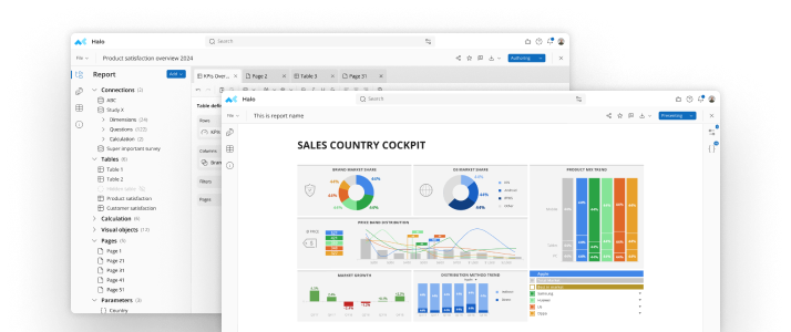
If you knew your customer satisfaction ratings were steadily declining, would you do anything differently? Chances are you would, or at least you should, and a keen way to spot trends that impact your business is with survey analysis software. Survey analysis software provides multiple tools to review your data, and these three are particularly useful for spotting data trends.FiltersSurvey analysis software typically comes equipped with filters that let you limit the data displayed. Let’s say you have responses from a customer satisfaction survey and you wanted to look at responses from specific types of customers. You could filter your data to display:
- Customers who spent at least $1,000 with your company
- Customers who live in a specific area or region
- Customers who shop online vs. in person for your products
- Customers who gave your company the highest marks for customer satisfaction
- Customers who gave your company the lowest marks for the same
Filters help pinpoint trends by letting you narrow down and dig deeper into your data based on select criteria. You can also apply more than one filter at a time, such as finding customers who spent at least $1,000, live in the northwest, and shop online for your products.CrosstabsCrosstabs are helpful for providing a quick review of data in a tabular format. Let’s say your customer satisfaction survey provided overall mediocre ratings of your company. Break down the responses into customer subsets, and you can determine if the lower rankings were coming from a specific customer group.Read More: How to Choose the Best Crosstab Software for Your BusinessCustomer Satisfaction Company Ranking

In the crosstab above, it’s immediately apparent that men gave your company notably higher customer satisfaction rankings than women. This lets you look into factors that may cause women to be less than satisfied with your company.You could apply additional filters and create a crosstab that further broke down the responses, perhaps looking at various age groups of men and women to see if that factor also played a role in satisfaction rates.GraphsWith their ability to provide a visual snapshot of data, graphs are another easy way to spot possible trends. They can be particularly helpful for reviewing data over a period of time. Let’s say you wanted to compare customer satisfaction survey results from surveys taken over the past four years.You could use a graph to visually display the percentage of men and women who ranked your company a four or above from 2014 to the present.Customer Satisfaction Ranking of 4 or Above The graph lets you instantly see that the satisfaction rate with men has been fairly steady, save for a slight dip in 2016. The satisfaction rate with women, which wasn’t high to begin with, has been on the decline every year.

Data trends can be crucial for planning your next strategic action. If you spot a positive trend, figure out what’s behind the positive response and do more of the same. If it’s a negative trend, determine what you can do to halt and reverse it. Survey analysis software provides filters, crosstab features, graph capabilities, and a host of other tools that give you valuable insights that can help continuously better your brand.
See mTab Halo in Action
Make smarter decisions faster with the world's #1 Insight Management System.


