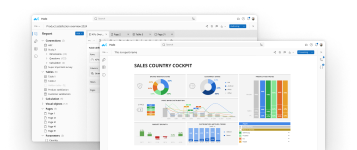
In an earlier post we talked about the difference between graphics used for visualization of data points and graphics used for presentation. We concluded that the point of an analyst's effort when analyzing survey data was to communicate the results to busy decision makers in a format they could understand.
Enter The Infographic
Using information graphics to convey an idea or meaning has been around since the earliest cave paintings. Today, infographics are an essential part of the survey analysts tool box because they convey complex data in an easy to follow and visually appealing format.From blog posts and web articles to glossy brochures and of course, data analysis presentation, infographics are a ubiquitous part of the information landscape. But why have they become so prevalent?
Infographics Are Easier Than Ever To Create
Modern computers and sophisticated software can easily render thousands, even millions, of data points into a visual representation, often with nothing more than a mouse click. What used to take hours to create by hand (and yes, most graphics used to be done by hand, I'm talking 1980s and 90s, not the 1800s!) can now be done as a matter of course.
Decision Makers Have Faster Access To More Data than Ever Before
The trend toward greater use of infographics results in part from the speed at which information is available to decision makers. The Internet and the World Wide Web have transformed not only how we receive our information but how fast we have access to it. Also, our expectations regarding how much information we are willing to absorb has changed. When was the last time anyone picked up a 2000 page reference book and actually read it?
It's Easier To Look At An Infographic Than It Is To Read About The Same Thing
Today data and information comes at us in packets. This blog post is an excellent example. It's short, concise, and to the point. The title and sub headings tell you most of what you want to know regarding the topic and they provide key information you might need to justify a decision to use more infographics in your next data analysis presentation. The rest of these words are written to support the headings but the important information might've been rendered visually rather than in prose. If it were, you might have spent half the time absorbing the information.Now, if I could present this post using only an infographic...

See mTab Halo in Action
Make smarter decisions faster with the world's #1 Insight Management System.


