Creating data visualizations that wow your audience means keeping your charts informative, compelling and easy to digest. The ideal way to achieve that goal is by engaging just the right balance of creativity, clarity and accuracy. These dos and don’ts for data visualization can help.Do Get a Bit Creative While you want to label your charts clearly so viewers can understand them at a glance, you can still get a bit creative with different options. These can include:
- Labeling each line individually.
- Rotating bar chart bars horizontally if the category names are long and would appear messy or confusing displayed vertically.
- Adding value labels directly on the bar chart bars to keep the appearance crisp and clean.
- Using simple icons, rather than standard geometric shapes, to represent different categories.
- Removing unnecessary gridlines to produce a cleaner look.
- Only using colors to isolate individual data series, not for differentiating all data series being displayed.
Don’t Go All-Out Crazy Adding a bit of creative flair to your data visualizations can make them more compelling, as long as you’re careful not to go overboard. Stylistic craziness to avoid includes:
- Too many icons, hard-to-read fonts or headache-inducing colors
- Blow-apart or 3D effects, both of which can make it tougher for viewers to make visual comparisons while decreasing overall comprehension.
- Changing styles midstream, or otherwise not being consistent with fonts, colors and other elements.
- More than six colors, or colors from the full spectrum. Comparisons are much more easily absorbed if you stick to a range of hues within the same color family. Also remember that some viewers may be colorblind. If you’re printing your charts in black and white, you need varying saturation levels for the colors to be accurately printed.
The focus of your data visualizations should be your charts and their titles. If they’ve become lost in the mix, you may have gone overboard with the visuals.Do Avoid DistortionsDistortions can happen even with the best intentions if you’re not careful about calculating and displaying your data. Avoid them by ensuring you:
- Refrain from rounding off percentages until the very end of the creation process.
- Use the full axis, starting at zero
- Never skip values when using numerical data
Don’t Overload Viewer with Info Adding too much data to a single chart defeats the entire purpose of survey data visualization, which is to quickly grasp the main points being made. If you find your chart bombarded with too much information, you can try changing the type of chart you’re using or simplifying the chart with a change of colors or arrangement of data.You may also find the extra information may do better as its own chart, rather than trying to cram it into the existing chart. Don’t Make Viewers Work for Results If your pie chart ends up with wedges that are nearly the same size, or your bubble chart has similar bubbles, make sure you do the extra calculations and showcase the results. Viewers should be easily able to understand the relationship between variable at a glance.Likewise, if you’re comparing two different charts, make sure you place them directly next to each other so viewers can quickly scan back and forth as needed.One final tip is to have a fresh set of eyes check out your chart before its official launch. You’ve been working closely with the data and fully understand what points you’re trying to make. Let someone else have a glance to ensure the same holds true for an audience viewing your data visualizations for the first time.


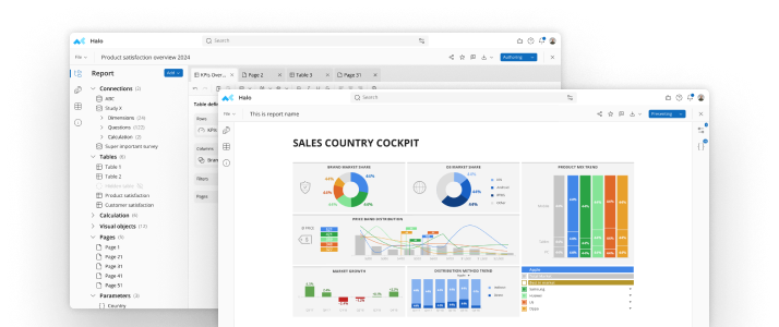
See mTab Halo in Action
Make smarter decisions faster with the world's #1 Insight Management System.
Insights for everyone, all in one place.
Book a demo