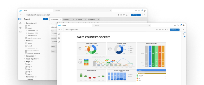
What is a Donut Chart?
A donut chart is a data visualization similar to a pie chart, but with a circular ring-like shape in the middle.

A donut chart is a data visualization similar to a pie chart, but with a circular ring-like shape in the middle.

A donut chart is a type of data visualization that displays data in a circular format with a hole in the center, creating a ring-like shape. It is similar to a pie chart, but with a space in the middle. The chart is divided into segments, with each segment representing a different category or portion of the data being presented. The size of each segment corresponds to the proportion of data that falls into that category, and the hole in the center can be used to display additional information or provide context to the data being presented.
Donut charts have become a popular tool in market research for displaying data in a visually appealing way. These charts are similar to pie charts, but with a hole in the center, creating a ring-like shape. In this post, we'll take a closer look at donut charts and how they can be used effectively in market research.
One of the main advantages of donut charts is their simplicity. They are easy to read and understand, making them an ideal choice for presenting data to stakeholders who may not have a strong background in data analysis. Additionally, donut charts allow market researchers to quickly identify trends and patterns in the data, which is crucial for making informed decisions.
Another benefit of donut charts is that they are highly customizable. Researchers can adjust the size of the hole in the center and the width of the ring to better reflect the data being presented. Additionally, donut charts can be formatted with different colors and fonts to make them more visually appealing and engaging.
There are a few types of donut charts that are commonly used in data visualization. Here are a few examples:
These are just a few examples of the different types of donut charts that can be used in data visualization. The type of chart you choose will depend on the data you are working with and the insights you want to convey.
Donut charts are a versatile type of chart that can be used in a variety of different scenarios. Here are a few examples of use cases for donut charts:
These are just a few examples of the many use cases for donut charts. By displaying data in a clear and visually engaging way, donut charts can help businesses and individuals gain valuable insights and make data-driven decisions.
Overall, donut charts can be an effective tool for market research when used appropriately. By keeping in mind their advantages and limitations, researchers can create compelling visualizations that help to identify trends and patterns in the data, allowing businesses to make data-driven decisions with confidence.
Try creating a donut chart for free using mTab survey analysis platform.
Make smarter decisions faster with the world's #1 Insight Management System.
