
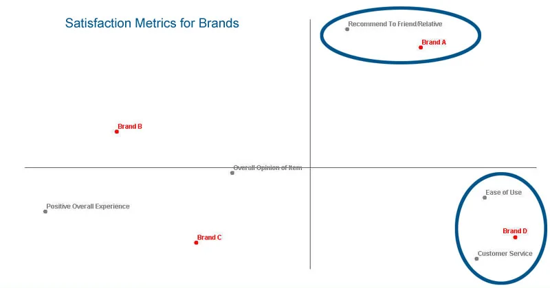
You have a brand by attribute table with fifteen brands down the side and twenty attributes across the top. That is three hundred cells, and the pattern you care about, which brands own which images, is buried in them. This guide covers how correspondence analysis builds a picture from that table, how to read the picture without fooling yourself, and where people go wrong.
Key takeaways
- Correspondence analysis turns a crosstab of two categorical variables, such as brands by attributes, into a map where categories with similar profiles sit close together.
- Read the map by the origin, which is the average profile, and by angles from the origin, because brand-to-attribute distances are not directly interpretable.
- Inertia is the chi-square statistic divided by the grand total, and each axis shows its share, so in the example the first two dimensions explain about 86%.
- Correspondence analysis describes association, not importance or significance, so test the underlying crosstab first and pair the map with driver data before recommending anything.
- Compare brands with brands and attributes with attributes, keep the same rows and columns when comparing waves, and report the axis percentages next to every map.
What is correspondence analysis?
Correspondence analysis (often shortened to CA) is a way of drawing a contingency table. A contingency table, which most researchers know as a crosstab, counts how many respondents fall into each combination of two categorical variables: brand and attribute, age group and preferred channel, region and product type. CA takes those counts and places every row category and every column category as a point on one shared map. Marketers use these maps as data-driven perceptual maps of brand positioning.
The placement follows one rule. Row points sit close together when the rows have similar profiles, meaning similar percentage distributions across the columns. Column points do the same for their profiles across the rows. A row and a column end up near each other, in the right direction from the center, when they are more strongly linked than you would expect if the two variables were unrelated.
CA is descriptive. It does not test a hypothesis, build a predictive model, or tell you which attributes matter to buyers. It summarizes the association that is already in your table, and it is good at that one job.
What table does correspondence analysis start from?
The input is a crosstab of counts, with one categorical variable in the rows and one in the columns. Every cell has to be a count or a frequency, so zero or positive numbers only. Percentages work because they carry the same information, and weighted counts work if you use the same weights as in your report.
Here is a small illustrative table. It is invented for this guide, not real data. Four fictional brands are rated on four attributes by a sample that produced 1,000 brand-attribute associations in total. Each cell counts how many times respondents linked that attribute to that brand.
| Reliable | Innovative | Good value | Trusted | Row total | |
|---|---|---|---|---|---|
| Alpha | 120 | 40 | 30 | 60 | 250 |
| Bravo | 50 | 110 | 45 | 35 | 240 |
| Cedar | 35 | 45 | 115 | 55 | 250 |
| Delta | 45 | 55 | 60 | 100 | 260 |
| Column total | 250 | 250 | 250 | 250 | 1,000 |
If you answered a pick-any question (“which of these describe each brand?”), the counts are mentions, not independent respondents. That is the normal shape of brand image data, and CA handles it, but remember that the table is counting associations, not people.
Your first read of this table is probably “Alpha is reliable, Bravo is innovative, Cedar is good value.” CA confirms that, and then shows something the table hides: how far each brand sits from the average, and along which direction.
How does correspondence analysis build the map?
You do not need to run the matrix algebra by hand, but you should know what it works with. Three ideas cover it.
Step 1: Turn counts into profiles
Divide each row by its total. Alpha’s profile is 120 / 250 = 48% Reliable, 16% Innovative, 12% Good value and 24% Trusted. Doing this for every row removes the effect of brand size, so a brand with many mentions does not dominate.
| Reliable | Innovative | Good value | Trusted | |
|---|---|---|---|---|
| Alpha | 48.0% | 16.0% | 12.0% | 24.0% |
| Bravo | 20.8% | 45.8% | 18.8% | 14.6% |
| Cedar | 14.0% | 18.0% | 46.0% | 22.0% |
| Delta | 17.3% | 21.2% | 23.1% | 38.5% |
| Average profile | 25.0% | 25.0% | 25.0% | 25.0% |
The last row is the average profile, the column totals as shares of the grand total. It is what every brand would look like if brand and attribute were unrelated. In this example it is a flat 25% because we built equal column totals. In real data it usually is not flat.
Step 2: Measure how far each profile is from the average
For each cell, compute the expected count under independence: row total times column total, divided by the grand total. For Alpha and Reliable that is 250 × 250 / 1,000 = 62.5. Alpha actually has 120, a surplus of 57.5.
The distance CA works with is a chi-square distance. Each cell’s squared gap from expectation is divided by the expected count, so a gap of 57.5 on an expected 62.5 counts for more than the same gap on an expected 500. For this one cell, 57.5² / 62.5 = 52.9.
Summing that quantity over all 16 cells gives the chi-square statistic for the table, 224.4 here. Dividing by the grand total gives the total inertia: 224.4 / 1,000 = 0.224.
Total inertia is the amount of association CA has to explain. A table where every brand has exactly the average profile has an inertia of zero.
Step 3: Find the best low-dimensional picture
The table has several dimensions of variation, but you want two. CA uses a decomposition (a singular value decomposition, if you want the term) to find the direction in which the profiles differ most, then the next most, and so on. Each direction is a dimension, and each dimension accounts for a slice of total inertia. Here are the results for our table.
| Dimension | Inertia | Share of total |
|---|---|---|
| 1 | 0.118 | 52.7% |
| 2 | 0.076 | 33.7% |
| 3 | 0.030 | 13.5% |
| Total | 0.224 | 100% |
With four rows and four columns, the table has at most three dimensions, which is the smaller of the two counts minus one. The map you draw uses the first two. Their coordinates for this illustrative data are below.
| Point | Dimension 1 | Dimension 2 |
|---|---|---|
| Alpha | -0.52 | 0.16 |
| Bravo | -0.01 | -0.49 |
| Cedar | 0.44 | 0.16 |
| Delta | 0.09 | 0.14 |
| Reliable | -0.51 | 0.10 |
| Innovative | 0.04 | -0.47 |
| Good value | 0.46 | 0.14 |
| Trusted | 0.02 | 0.22 |
Plotted, the map shows Alpha and Reliable on the left, Cedar and Good value on the right, Bravo and Innovative at the bottom, and Delta and Trusted near the middle.
How do you read a correspondence map?
Most misreadings come from using the map in ways the geometry does not support. Four rules cover almost everything.
What does the origin mean?
The origin, the point where the axes cross, is the average profile. A brand near the origin looks like the average of all the brands on these attributes. An attribute near the origin is one that does not separate the brands, because everyone gets about the same share of it.
Near the origin does not mean unimportant, and it does not mean the brand has no image. It means undifferentiated on this table. The further a point is from the origin, the more its profile departs from the average, so spend your attention on the points near the edges.
What do angles tell you?
Draw a line from the origin to a brand and another from the origin to an attribute. When the angle between the two lines is small, the brand is being linked to the attribute more than average. At roughly 90 degrees, the link is about average. When the two points are on opposite sides of the origin, the brand is linked to the attribute less than average.
Angles are the dependable way to read a brand against an attribute. They only work for points that are well away from the origin, and they are only as good as the map’s share of inertia, which we get to shortly.
What do distances between points mean?
This is where the legacy advice, and a lot of online advice, goes wrong. There are two kinds of distance.
- Row to row, and column to column. The distance between two brands reflects how different their profiles are. Alpha and Cedar are far apart on our map because one is heavy on Reliable and the other on Good value. Two attributes are close when the same brands tend to receive them.
- Row to column. The distance between a brand and an attribute is not directly interpretable in the standard symmetric map. The two sets of points are scaled separately, so you cannot lay a ruler between Bravo and Innovative and read off the strength of their link. Use the direction from the origin, not the gap.
A tidy way to remember it: compare brands to brands, attributes to attributes, and read brand-to-attribute links by angle.
How do you read a real correspondence map?
Here is a map that ran with this page for years. It shows small SUV models and the purchase influencers associated with them. The red circles are models, and the blue diamonds are influencers.
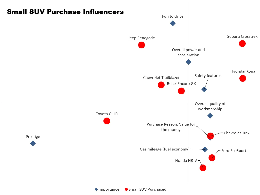
Start with the origin. Safety features and overall quality of workmanship sit close to the center, and so do the Chevrolet Trailblazer and Buick Encore GX. Those two influencers do not separate the models much, and those two models look closest to the average.
The earlier version of this page said safety and quality were near the center because most buyers want them. The map cannot show that. It shows only that the models are not differentiated on those two items.
Then use direction. The Jeep Renegade sits in the direction of Fun to drive, and the Toyota C-HR in the direction of Prestige. The Chevrolet Trax, Ford EcoSport and Honda HR-V sit lower right, toward value for the money and gas mileage.
Notice the Subaru Crosstrek and Hyundai Kona, far out on the right with no influencer beside them. They are distinctive, but the first two dimensions do not show why. That is a sign to look at the table, or at a third dimension, before writing a story about them.
What are inertia and variance explained in correspondence analysis?
Inertia is the name CA uses for the variation in the table, measured as the chi-square statistic divided by the grand total. Each dimension takes a share of it, and the shares add up to 100% across all the dimensions. When software prints “variance explained” or “percentage of inertia” on each axis, that is the number.
In our example, dimension 1 explains 52.7% and dimension 2 explains 33.7%, so the map shows about 86% of the association. The remaining 13.5% lives in dimension 3, which a flat map cannot display. That hidden share is why Delta looks nearly average on the map. Delta’s own distinct profile, a lean toward Trusted, shows up mainly on the third dimension.
Use the percentages as a check on how much to trust the picture. When the first two dimensions explain most of the inertia, the map is a faithful summary. When they explain a smaller share, the map is hiding structure, and distances and angles on it will mislead you more often. There is no universal cutoff, so report the percentages next to every map.
Total inertia, which measures the strength of the association, is a separate question from how much of it the first two axes capture. A map can show 95% of a very weak association.
What is multiple correspondence analysis?
Standard CA handles two variables at a time. Multiple correspondence analysis (MCA) extends the idea to three or more categorical variables at once, for example age group, region, preferred channel and product owned. Instead of one crosstab, it works from a table that records each respondent’s category for each variable, and it places all the categories of all the variables on one map. Categories that tend to occur together in the same respondents sit near each other.
MCA is useful for exploring how many categorical questions fit together. Read it with the same rules about origin and distance, but be careful with the inertia percentages, which are usually low for MCA even when the map is informative. For a first pass, start with ordinary CA on the two variables you care about most.
What are the common misreadings?
These are the mistakes we see most often, including some that appear in older guides.
- Reading association as importance. A brand can be strongly linked to an attribute that buyers do not care about. The map shows what is associated, not what drives choice. Pair it with driver or importance data before recommending anything.
- Measuring brand-to-attribute distance with a ruler. Row-to-column gaps are not interpretable on their own. Read the angle from the origin, and keep distance comparisons within rows or within columns.
- Treating the axes as named, fixed things. The dimensions are mathematical. The label “premium versus value” is your interpretation of what sits at each end, and a different set of brands could change it.
- Ignoring the percentages. A map explaining a modest share of inertia can look just as crisp as one explaining most of it. Check the axis percentages every time.
- Treating the map as a significance test. CA describes a pattern, and a pattern can come from sampling noise, especially with small bases. Check the table first, for example with a chi-square test, and see what statistical significance means before you present a gap as real.
- Comparing maps from different table sets. Add or remove a brand and the whole map moves, because the average profile changes. To compare waves or segments, keep the same rows and columns, or fit them in one analysis.
How do you do correspondence analysis in practice?
Start with a clean crosstab: the right base, the right weights, and categories you can defend. Run CA on that table, check the share of inertia for the first two axes, and then read the map in the order given here: origin, then edges, then angles, then brand-to-brand comparisons. Use the table to confirm every claim you plan to make.
Halo Reports, mTab’s reporting product, builds weighted crosstabs and banner tables with significance testing, and turns them into charts and interactive report pages. That is the table-building step done well, which is where a good correspondence map begins. See Halo Reports for the details. If the table comes from a brand tracker, you can also track brand health, consideration and competitors continuously, so each new wave gives you a fresh table to map.
Next time you have a large brand by attribute table, find the points furthest from the center first, write down what the table says about each, and only then look at the map to see whether the picture agrees. If your team runs wide, complex studies and global brand trackers, mTab for insights and research teams keeps them on one governed platform.