
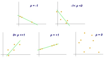
You have a survey back and a plain question on the table: do customers who rate us higher also buy more often, and by how much? You could compare averages in a crosstab, but that only works once you have chosen cut-offs. Correlation analysis answers the question directly, on the full scale, with a single number. This guide covers how that number is built, how to read it, and where it misleads.
Key takeaways
- Correlation analysis measures how strongly two variables move together, using a coefficient from -1 to +1 whose sign shows direction and whose size shows strength.
- Squaring the coefficient gives the share of shared variation: an r of 0.3 means about 9% is shared, and an r of 0.5 leaves three quarters unexplained.
- Match the coefficient to your data: Pearson for straight-line numeric relationships, and Spearman or Kendall’s tau for ranks, short rating scales and data with outliers.
- Correlation does not prove causation, because one variable may cause the other, a third factor may drive both, or the link may be coincidence.
- Always plot the pair, since a single outlier can create a correlation and a coefficient near 0 can hide a curved relationship.
What does a correlation coefficient tell you?
A correlation coefficient summarizes the relationship between two measured variables in one number between -1 and +1. In a sample it is written r; in a whole population it is written with the Greek letter rho, as in the charts at the top of this page. Two things matter: the sign and the size.
- A positive value means the variables rise together. Respondents who score high on one tend to score high on the other.
- A negative value means one tends to fall as the other rises, such as price sensitivity and brand loyalty.
- A value near 0 means there is no straight-line relationship. It does not mean there is no relationship of any kind, because a curved pattern can produce a coefficient near 0.
- +1 or -1 means every data point falls exactly on a straight line. You will almost never see this in survey data.
The size tells you how tightly the points hug a line. As rough rules of thumb for survey and attitude data, an absolute value below 0.2 is negligible, 0.2 to 0.39 weak, 0.4 to 0.59 moderate, 0.6 to 0.79 strong, and 0.8 or more very strong. Cutoffs differ by field, so treat them as labels for conversation, not thresholds for decisions. A correlation of -0.70 is exactly as strong as +0.70.
What does squaring the coefficient mean?
Square r and you get the share of variation the two variables have in common. An r of 0.3 squares to 0.09, so about 9% of the variation is shared. An r of 0.9 squares to 0.81, so about 81% is shared. This is why a “moderate” correlation is less useful than it sounds: 0.5 leaves three quarters of the variation unexplained.
How do you calculate a correlation?
Pearson’s r is the covariance of the two variables divided by the product of their standard deviations. Covariance measures how much the variables vary together. Dividing by the standard deviations removes the units, which is why a 0–10 rating and a count of purchases can be compared.
The arithmetic is shorter than the definition. For each respondent, take the distance of each value from its average, multiply the two distances, and add them up. Then scale by the spread of each variable.
Here is an illustrative example, not real data. Eight customers rate satisfaction (x) on a 0–10 scale, and we record how many times each bought in the past six months (y). The average satisfaction is 7 and the average number of purchases is 4.
| Customer | x | y | x minus 7 | y minus 4 | Product | (x minus 7) squared | (y minus 4) squared |
|---|---|---|---|---|---|---|---|
| 1 | 4 | 1 | -3 | -3 | 9 | 9 | 9 |
| 2 | 5 | 3 | -2 | -1 | 2 | 4 | 1 |
| 3 | 6 | 2 | -1 | -2 | 2 | 1 | 4 |
| 4 | 7 | 4 | 0 | 0 | 0 | 0 | 0 |
| 5 | 7 | 3 | 0 | -1 | 0 | 0 | 1 |
| 6 | 8 | 6 | 1 | 2 | 2 | 1 | 4 |
| 7 | 9 | 5 | 2 | 1 | 2 | 4 | 1 |
| 8 | 10 | 8 | 3 | 4 | 12 | 9 | 16 |
| Sum | 29 | 28 | 36 |
So r = 29 / √(28 × 36) = 29 / √1,008 = 29 / 31.75 = 0.913. Squared, that is 0.83. In this sample, satisfaction and purchase count share about 83% of their variation, which is a very strong positive relationship.
Eight respondents is a thin sample, and sample size sets the bar for significance. With 8 respondents, r has to exceed about 0.71 to be statistically significant at the 5% level, so 0.913 clears it. With 1,000 respondents the bar drops to about 0.06.
Significance tells you a relationship is probably not zero. It does not tell you the relationship is big enough to matter.
Which correlation coefficient should you use?
The coefficient is a choice, and it should match your data.
- Pearson measures straight-line relationships between numeric variables. It is the default.
- Spearman and Kendall’s tau work on ranks. They suit 5-point scales, ordered categories, and relationships that rise steadily without being straight, and they are less affected by outliers. In the example above, Spearman gives 0.92 against Pearson’s 0.91, because the pattern is close to a line either way.
- Point-biserial compares a two-category variable, such as owner versus non-owner, with a numeric one.
For rating scales with only five or seven points, Spearman is usually the safer default. For unordered categories, such as favorite brand, a correlation coefficient is the wrong tool; use a chi-square test or a crosstab instead.
How do you read a correlation matrix?
One coefficient answers one question. A survey usually has dozens of questions, so analysts calculate every pair and lay them out in a square table called a correlation matrix. The diagonal is always 1, because each variable correlates perfectly with itself, and the table mirrors across the diagonal.
Read it in two passes. First scan for clusters of high correlations, which suggest several questions are measuring the same underlying idea. Then read down the column for your outcome, whether that is satisfaction, purchase intent or likelihood to recommend, to see which items relate most strongly to it. Our guide to reading a correlation matrix walks through a full survey example with the strength cutoffs and the choice of coefficient.
How should you visualize correlations?
A wall of decimals hides the structure, so chart it. A heatmap of the matrix, sorted so related items sit next to each other, shows the clusters at a glance. A scatter plot shows one pair honestly, including the outliers and curved patterns that a single coefficient hides.
For a stakeholder audience, a ranked bar chart of each item’s correlation with the outcome is usually clearer than the matrix itself. The guide to visualizing correlations in survey analysis compares these options and when to use each.
What do residuals add to correlation analysis?
Correlation tells you how well a straight line fits. It does not tell you where the line fails. That is the job of residuals, the gap between each respondent’s actual value and the value a fitted line predicts.
Suppose you predict repeat purchases from satisfaction. If the residuals look random, the line captures the pattern. If they cluster by segment, say new customers are consistently below the line and long-time customers above it, then something is missing: a variable, a curved relationship, or a group that behaves differently.
Residuals also expose single respondents who sit far from the pattern. The guide to residuals, with formula and worked examples shows how to calculate and plot them.
Does correlation mean causation?
No. A strong coefficient tells you the variables move together, not why. There are four common explanations for any correlation:
- A causes B. Better service raises satisfaction.
- B causes A. People who already like a brand rate its service higher.
- C causes both. Customers with long tenure tend to be more satisfied and also buy more often, so tenure may produce the whole relationship.
- Coincidence. In one sample, two unrelated measures happen to line up.
Correlation analysis cannot separate these. To make a causal claim you need a design that rules out the alternatives, such as a randomized experiment or a panel that measures the same people over time, or at least a plausible theory and controls for the obvious third factors. In practice, use correlation to decide what to investigate, then use design to find out why.
How is correlation analysis used in market research?
Correlation analysis earns its place in a few specific jobs.
- Finding what relates to an outcome. Correlate each attribute rating with overall satisfaction or purchase intent to see which items move with it. This is a starting point for a driver analysis, and it tells you where to look, not what to fix.
- Spotting redundant questions. Two items that correlate above 0.8 are probably measuring the same thing. You can drop one from the next wave or combine them into a scale.
- Checking tracker consistency. If two measures that used to move together suddenly separate across waves, something has changed in the market or in the questionnaire.
- Screening for segments. A relationship that is strong in one group and absent in another is a reason to analyze the groups separately. To see what drives satisfaction and loyalty by segment, start there.
It is not a measure of campaign effectiveness. Showing that ad awareness and purchase intent move together does not show the advertising caused the change. Effectiveness needs a comparison, such as exposed versus unexposed groups or before versus after, with controls.
What are the common mistakes?
- Reading 0 as “no relationship.” A coefficient near 0 means no straight-line relationship. A U-shaped pattern can score near 0, so plot the pair before you rule it out.
- Letting an outlier decide. Here is an illustration. Ten customers: nine ordinary ones make 1 to 9 visits a year and spend between $20 and $60, and one reseller makes 30 visits and spends $400. Pearson’s r across all ten is 0.95. Remove the reseller and it drops to 0.07. One person created the whole relationship. Always plot the pair, or use Spearman.
- Treating significance as importance. In a large sample, tiny correlations are significant. Look at the size of r, and its square, before you act.
- Scanning too many pairs. A matrix of 20 variables has 190 unique pairs. If none of the relationships were real, about 9 or 10 pairs would still cross the 5% threshold by chance. Treat surprising pairs as leads for a follow-up, not findings.
- Correlating items that overlap by design. Two questions that ask about the same idea in different words will correlate highly. That is a measurement result, not a discovery.
- Using unweighted data on a skewed sample. If your sample over-represents one group, the coefficient describes the sample, not your market. Apply the same weights you use elsewhere in the report.
How do you do this in practice?
In Halo Reports you can cross survey questions, apply weighting, run significance testing, and publish the results as charts and interactive report pages, so correlation findings sit on the same weighted data as the rest of your analysis. See Halo Reports for what it covers.
For your next survey, pick one outcome you care about and five or six attributes you have a reason to compare. Calculate the correlations, plot the two or three strongest and any that surprise you, and note which ones are plausibly caused by something else before you present them. If you run wide, complex studies or global brand trackers, one governed platform for insights teams keeps them in one place.