
You have a table of survey results, a meeting on the calendar, and a choice of a dozen chart types in the toolbar. Most of the decision comes down to one thing: what the audience needs to see. This guide is the table of contents for charting survey data. It starts with which chart answers which question, then covers each chart type with a link to a full article, the rules that keep survey charts honest, and how to chart results across waves.
Key takeaways
- Charting survey data starts with the question the reader will ask: bar and column charts compare categories, stacked bars show scales, and lines show trends.
- Bar and column charts beat pie charts for comparison, because people judge length along a shared baseline more accurately than angle or area.
- Keep pie and donut charts for one part-to-whole split with two to five categories, and use 100% stacked bars to compare a scale across groups.
- Honest survey charts show the base, start bar axes at zero, sort deliberately, mark significant differences, and use color to carry meaning.
- Across waves, compare each change with sampling error: with 1,000 respondents per wave, a 5-point rise cleared the 4.3-point margin and a 3-point rise did not.
Which chart answers which question?
Start with the question the reader will ask, not with the chart you like. Each common survey question has a chart that answers it directly and a couple that make the answer harder to see.
| The reader wants to know | Best chart | Full guide |
|---|---|---|
| How are the answers to one question distributed? | Bar chart or column chart, sorted by value | Bar chart, column chart |
| How do groups compare on a rating scale? | 100% stacked bar, one bar per group | Stacked bar charts |
| How does an agreement scale break down? | Stacked bar with scale points in order | Likert scale charts |
| What is one part-to-whole split? | Pie or donut, with few categories | Pie chart, donut chart |
| How has a measure moved over waves? | Line chart, or columns for a few waves | Covered below |
| Which attributes go with which brands? | Correspondence map or sorted heatmap | Covered below |
If you cannot say in one sentence what the chart is meant to show, the chart is not ready. The sentence becomes the title.
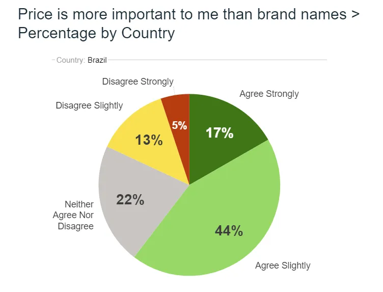
The chart above is a fair use of a pie: one group, one scale, five slices, and the message is that most people agree. It stops working the moment you add a second country, because comparing slices across two circles is hard. That is the point where the table sends you to stacked bars.
Why do bar and column charts beat pie charts for comparison?
People judge length along a shared baseline more accurately than they judge angle or area. Two pie slices of 28% and 31% can look the same, while two bars of those lengths do not. Bars also leave room for the things survey charts need: sorting, significance markers, a comparison group and a base.
Pie charts cannot show change, segments or significance. Keep them for a single split where the message is “most of the total is X”. For everything else, bars are the safer default.
When should you use each chart type for survey data?
Each chart below has its own article with worked examples. These are the short versions, enough to choose between them.
Bar chart
A bar chart compares values across categories using the length of horizontal bars. It is the default for single-choice and multiple-response questions, for long category names and for any list longer than a handful of items. Sort the bars from largest to smallest unless the categories have a natural order. Our guide on what a bar chart is covers types, examples and layout.
Column chart
A column chart is a bar chart turned upright, which suits a few categories with short labels and any series where time runs along the horizontal axis. Use columns for three waves of a tracker or a before-and-after result, and bars for ten brands with long names. The article on column charts explains the choice in detail.
Pie chart
A pie chart shows one whole divided into slices. It works for a single-choice question with two to five answers where at least one slice is clearly larger or smaller than the others. The angle of each slice is its share multiplied by 360 degrees, so a 25% slice sweeps 90 degrees. Read what a pie chart is for slice calculations and design rules.
Donut chart
A donut chart is a pie chart with the center removed, which makes room for a total, a base or a headline score. It follows the same rules as a pie and is read by arc length rather than area, which makes it slightly harder to judge. Choose it when the hole earns its place. The guide to the donut chart shows examples and when to prefer a plain pie.
Stacked bar chart
A stacked bar splits each bar into one segment per answer, so you can see how a total divides. With a 100% stacked bar, every bar has the same length, which lets you compare the mix of answers across groups of different sizes. It is the right chart for comparing one question across segments, countries or waves. See stacked bar charts for survey data for construction and labeling.
Line chart
A line chart shows how a measure moves across many time points. For a tracker with six or more waves, a line makes direction and turning points visible in a way columns do not. Label every wave on the axis, mark the base for each wave, and add a confidence band or a significance marker, because survey results wobble with sampling alone. For fewer than four waves, columns are clearer.
How do you chart a rating scale?
Chart the full distribution, not only an average. A mean of 3.8 on a five-point scale can come from a tight cluster around 4 or from a split between 5s and 2s, and the average hides the difference.
For a five-point scale across six segments, draw one 100% stacked bar per segment with the five points in order and a diverging color ramp: negatives in one hue, positives in another, neutral in gray. Align the bars on the neutral point if the comparison is agreement versus disagreement. Label the top-box value, such as the share answering 4 or 5, at the end of each bar. Our guide to using the Likert scale for visualizing survey data walks through the full method.
What rules keep survey charts honest?
Survey charts are estimates from a sample, so they need a few habits that general business charts can skip. Most of the mistakes we see come from breaking one of these five.
- Show the base on every chart. Write it under the title: “All respondents, n = 1,000” or “Buyers in the last 30 days, n = 412”. Without the base, readers do not know who the percentages describe or how reliable they are.
- Start bar axes at zero. Bars encode value as length, so a cut-off axis makes a 3-point gap look like a 30-point one. A line chart may use a narrower range, as long as the axis is labeled.
- Sort deliberately. Sort bars by value unless the categories have a natural order, such as age bands or a rating scale. Keep “Other” and “Don’t know” at the end, whatever their size.
- Mark significant differences. A gap between two groups is only worth a headline if it is larger than sampling error. Use a marker or a letter and say which test and confidence level you used, for example 95%.
- Use color to carry meaning. One color for the brand of interest and a neutral for the rest. A ramp for an ordered scale. The same color for the same thing on every page.
Two further rules apply to the whole page. Put the finding in the title, not a label: “Consideration fell among first-time buyers” rather than “Consideration by segment”. And keep one message per chart. If a chart needs a paragraph of explanation, split it in two.
How do you chart survey data across waves?
A tracker repeats the same questions on a schedule, so the chart has to show direction and tell real movement from noise. Two things make this work: a consistent base in every wave, and a test for whether each change is larger than sampling error.
Worked example: brand consideration over three waves
Suppose a brand tracker asks 1,000 people in each wave whether they would consider the brand. The figures are illustrative, and assume a simple random sample with no weighting.
| Wave | Considering the brand | Change from previous wave | Margin for the change (95%) | Significant? |
|---|---|---|---|---|
| Wave 1 | 38% | n/a | n/a | n/a |
| Wave 2 | 41% | +3 points | ±4.3 points | No |
| Wave 3 | 46% | +5 points | ±4.3 points | Yes |
The margin comes from the standard error of the difference between two proportions. For waves 2 and 3 it is the square root of (0.41 × 0.59 ÷ 1,000 + 0.46 × 0.54 ÷ 1,000), which is about 0.0221.
Multiply by 1.96 and you get 4.3 points. The 5-point rise from wave 2 to wave 3 clears that margin, while the 3-point rise from wave 1 to wave 2 does not (its margin is also 4.3 points). Wave 3 against wave 1 is up 8 points, which is clearly significant.
So the honest title for the chart is “Consideration rose in wave 3”, not “Consideration has risen for three waves”. A column chart suits three waves. Past five or six, switch to a line and add the confidence band.
For a tracker you can also keep the stacked-bar view: one 100% bar per wave, with the scale points in the same order and colors every time. Readers then see the whole distribution shift, not only the top box.
Keep the chart identical from wave to wave
If the layout, colors and order change each wave, readers spend their attention on the format instead of the result. Fix the template once and generate every wave from the same tables, so a number on the chart always matches the number in the crosstab. If a question wording or a weighting scheme changes, mark the break in the series with a gap or a note. Do not join the lines across it.
How do you turn charts into a story people remember?
A chart answers one question, but a report has to move a reader from what happened, to why it matters, to what to do next. Choose the three or four charts that carry that argument, put a finding in each title, and leave the rest in an appendix. If the audience is senior, an executive brief can carry them as a one-page update of what changed, why it matters and what to do. Our guide on creating infographics with data shows how to combine charts, numbers and short text into a single visual summary for people who will not read a table.
Senior readers usually need the answer first, then the chart that supports it, then a way to drill down if they doubt it. Slides carry a narrative to a meeting, while a live view such as mTab Pulse, which monitors trackers and surfaces meaningful movement, answers recurring questions between meetings. Most teams need both, built from the same tables. The failure mode is a view that shows everything and a deck rebuilt by hand each wave.
How do you build these charts in practice?
Tabulate first, then chart. In Halo Reports you can run weighted crosstabs with significance testing and turn the results into charts and interactive report pages, so the bases and significance markers on the chart come from the same tables you checked. Spreadsheet tools can draw all of the charts above, provided you carry the base and the test results across yourself.
Before your next report, take your three most important survey results and write the one-sentence finding for each. Pick the chart from the table at the top, sort it, add the base, and mark what is significant. Then read the title aloud to someone outside the project. If they can say what the chart shows without reading the labels, it is ready.